Well.....well....well! Somebody is actually reading my blog! You guys were commenting like it was 2014:)
I am so proud of this project and could not be happier that it was published in Southern Homes. It was a perfect fit for their Before and After issue.
Just to review...... my clients had lived in this house for over 20 years and raised their 3 children there. It is in a great location and after looking for a new house [with no luck] they decided to do the renovation.
After it was all done there was not one inch that wasn't updated including the whole unbuilt space downstairs adding a bedroom, bath, office another family room, sitting area, 1/2 bath, and gym!
So....today I am showing you the living room/dining room which were 2 rooms before and now have been opened up to one large space.
Right behind the kitchen was the DR
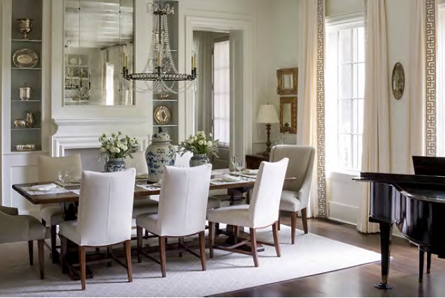
After.....
Before
2 doorways were added into the kitchen/family room. The bookcases were also taken out.
She opted for a more casual space and the Charles Stewart dining chairs are covered in performance fabric!
One of my favorite things is the makeover of the fireplace including the antique mirror over the mantel.
Circa Lighting chandelier
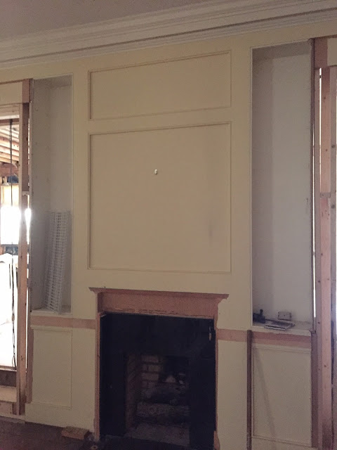
During....
Before of the living room
As you can see there were doors in-between the DR/LR. We also changed the windows and got rid of the arches for a more streamline look.
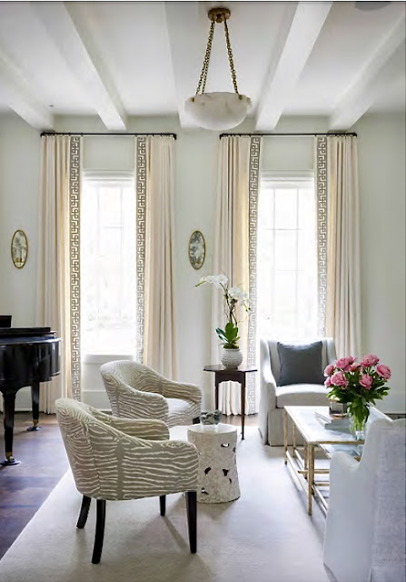
Love this Lee Jofa trim....which helped to define the white curtains from the white walls.....Benjamin Moore White Dove
After.....same direction view. Circa Lighting fixtures
All upholstery is Charles Stewart. Paint color Benjamin Moore White Dove.
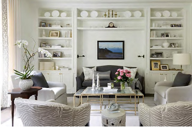
This became a long room and I wanted to add some of the bookcases back for texture.
Before
During
I decided to frame them around the sofa.
As I said in the first post we re-used most of the clients art which had been collected over the years from their travels.....
You can see here it is all one space now....
I think this was the day I found this awesome coffee table from Bungalow Classic.
It was perfect for the space.
I really tried to give her a classic look....something that would stand the test of time....using as many of her accessories and such as I could so it would feel like home.
Architect: Linda Macarthur
Builder: Michael Ladisic
I managed to make it through the week without any incidents.....meaning no change of clothes in the middle of the day....hahaha
I did do something stupid like wear new shoes to the Mart one day and now I am sporting ugly blisters on both of my heels....which limits my shoe wearing at this time.
Crikey it's always something.
OK.....here are the three subscriptions! Please email me with your address!
Regina S. said...
Architect: Linda Macarthur
Builder: Michael Ladisic
I managed to make it through the week without any incidents.....meaning no change of clothes in the middle of the day....hahaha
I did do something stupid like wear new shoes to the Mart one day and now I am sporting ugly blisters on both of my heels....which limits my shoe wearing at this time.
Crikey it's always something.
OK.....here are the three subscriptions! Please email me with your address!
Oh my gosh this made my morning! I love how real you are! Love everything on this reno. I would love to read this magazine!
I love everything about this house that we see so far. Will we get to see the rest?
Bless your heart, haven't we all been there at one time in our lives! 😂Love your honesty and love everything you design. Keep it up!!!


